As I’ve been illustrating over the years I’ve realised there’s a few factors you can apply to illustrations that really up the quality, which is a God send when you’re illustrating fast and don’t have time to perfect every aspect. So here’s 5 easy tips to improve your illustrations!
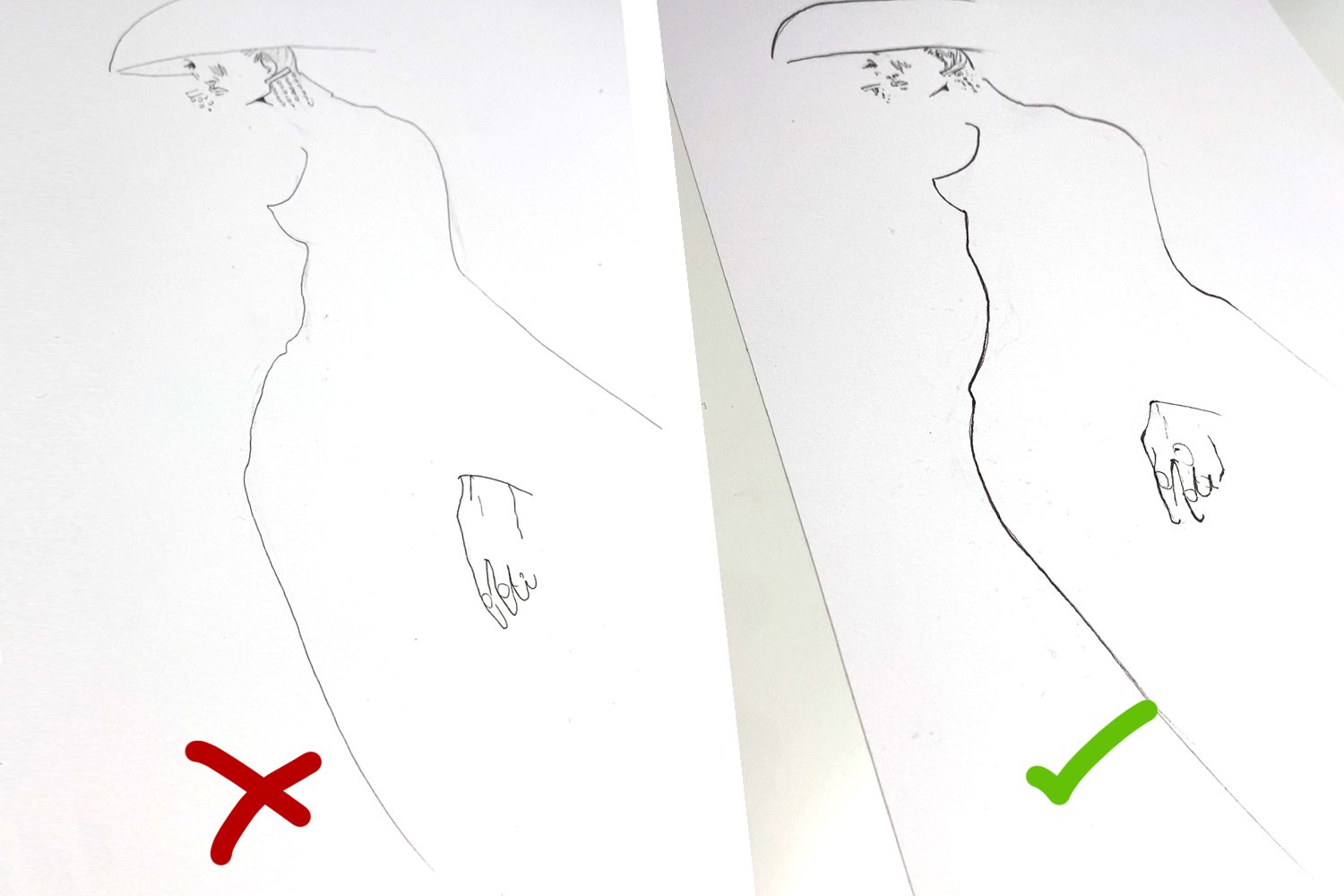
Tip 1 – Line Width:
This one makes the biggest difference, it’s subtle but effective. Try to stay away from inking your whole piece in one thickness, add some variety. Two ways to achieve this, either use a variety of fineline sizes, the Winsor & Newton fineliners come in sizes 0.1, 0.2, 0.3 0.5, 0.8 and 1.0 so using a few of those will get the job done. Another way which should be used as well is applying more pressure to the pen at certain times during the inking. This’ll make the stroke thicker in places giving it more depth. Perfect for using around joints, on shoulders, finger tips etc just to add that extra oomph.

Tip 2 – Shape with Brushstrokes:
Instead of colouring the area in as quickly and flat as possible focus on crafting the shape of what you’re colouring in with the strokes. I’m using Pro Markers as their chiselled nib is great to use creating shape. If what you’re colouring in is circular then curve your brush strokes to help give the illusion of depth, fanning them out and breaking them off where the hat ends.

Tip 3 – Texture:
I’ve only started mixing media recently but I’m loving it. Instead of using 4 shades of Pro Marker to show gradation and shadow, put the base colour down in Pro Marker then grab some Winsor & Newton colouring pencils and apply the darker tone with that. It gives the illustration a lot more texture and helps lift it from the page as there’s more for the eye to take in.

Tip 4 – Energy:
When colouring in try not to be timid with your movements, this one takes practise but if you’re expressive and confident with your lines and brush strokes it will translate into giving the illustration more energy and help it leap off the page. Instead of slow and steady with a Promarker or pencil, do gestures that move your whole wrist, flick across the page to give the illusion your illustration is moving.

Tip 5 – Highlights:
This is always my favourite step in an illustration, grab some Liquitex Heavy Body white and a teeny paint brush and add some highlights onto the illustration. Where there would naturally be a reflection or somewhere to just break up a solid bit of colour. This one’s a game changer if used correctly!